Spendr
A one week sprint.
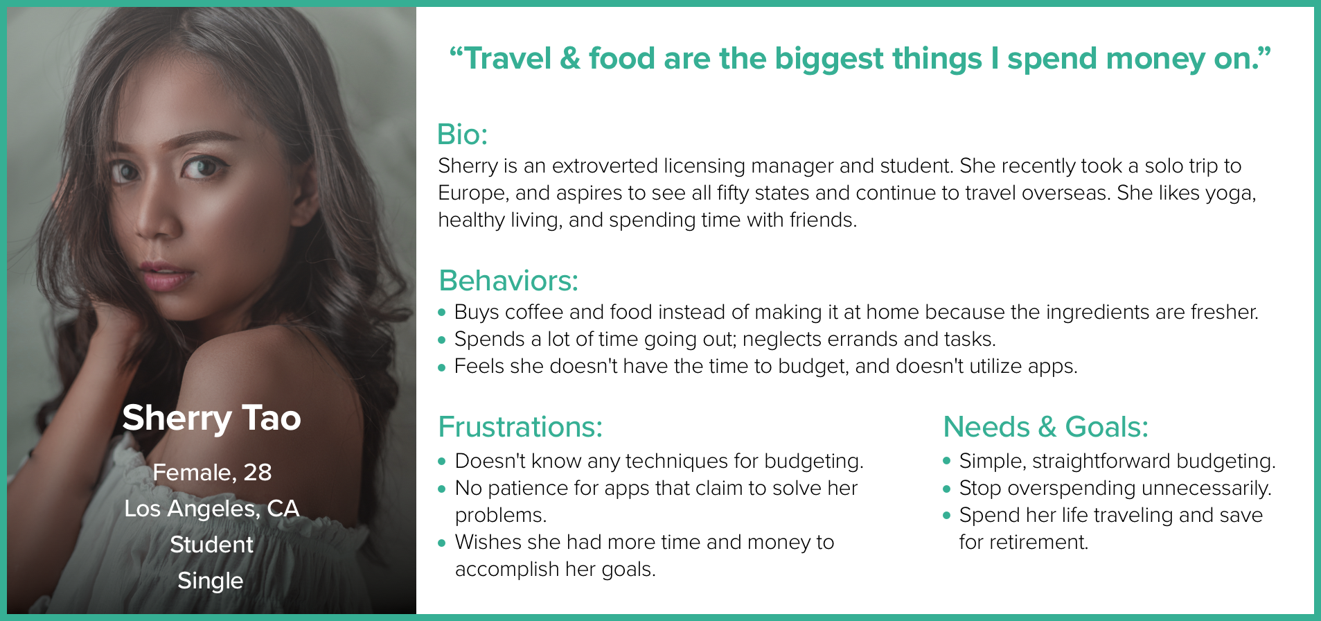
The Challenge: My mission was to design an app for a specific user's needs in a week's time. My user was Sherry Tao, a firecracker with a busy schedule and a love of fine dining and fresh ingredients. She dreams of someday owning a home, seeing all 50 states, and getting a dog. The problem is, she has no savings to do any of those things.
Day 1
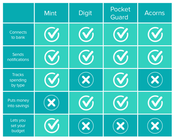
My initial interview of Sherry was to gain insights into her daily life and pain points. She ran through her routine and I was able to gauge that she leads a busy, active, extroverted lifestyle. This helped me to delve deeper into her pain points and discover that she has a lot of problems overspending. This was a challenge for me, because I don't typically have budgeting issues. So I conducted a feature analysis on other apps that exist for this purpose. I came to the conclusion that it would be best to have the app link to bank accounts, as that seems to be the simplest way to track spending.
Day 2
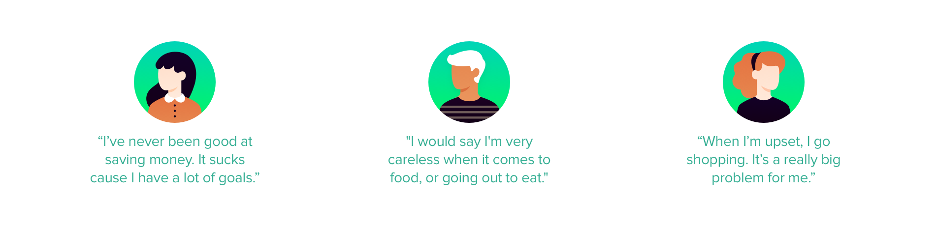
I conducted a second, formal user interview to learn more about Sherry’s specific spending concerns and frustrations. Her budgeting issues are mostly food based, as she tends to eat out for most of her meals and goes to coffee shops every day. This interview was enlightening because I came to learn that Sherry does not utilize apps. I realized I would have to think outside the box to create an app for someone who doesn't like them. I flushed out that she would be better served by a notification system (another insight gained from my C&C) that requires little effort. She told me that she would rather the notifications be mean because it would motivate her more.
I then interviewed three other potential users for further insights. One of them was extremely proficient at cutting costs wherever she could, as well as saving money for her goals. I realized she would not be the target user of the app. But the other two interviews were successful into giving me further insights into why individuals overspend.
Day 3
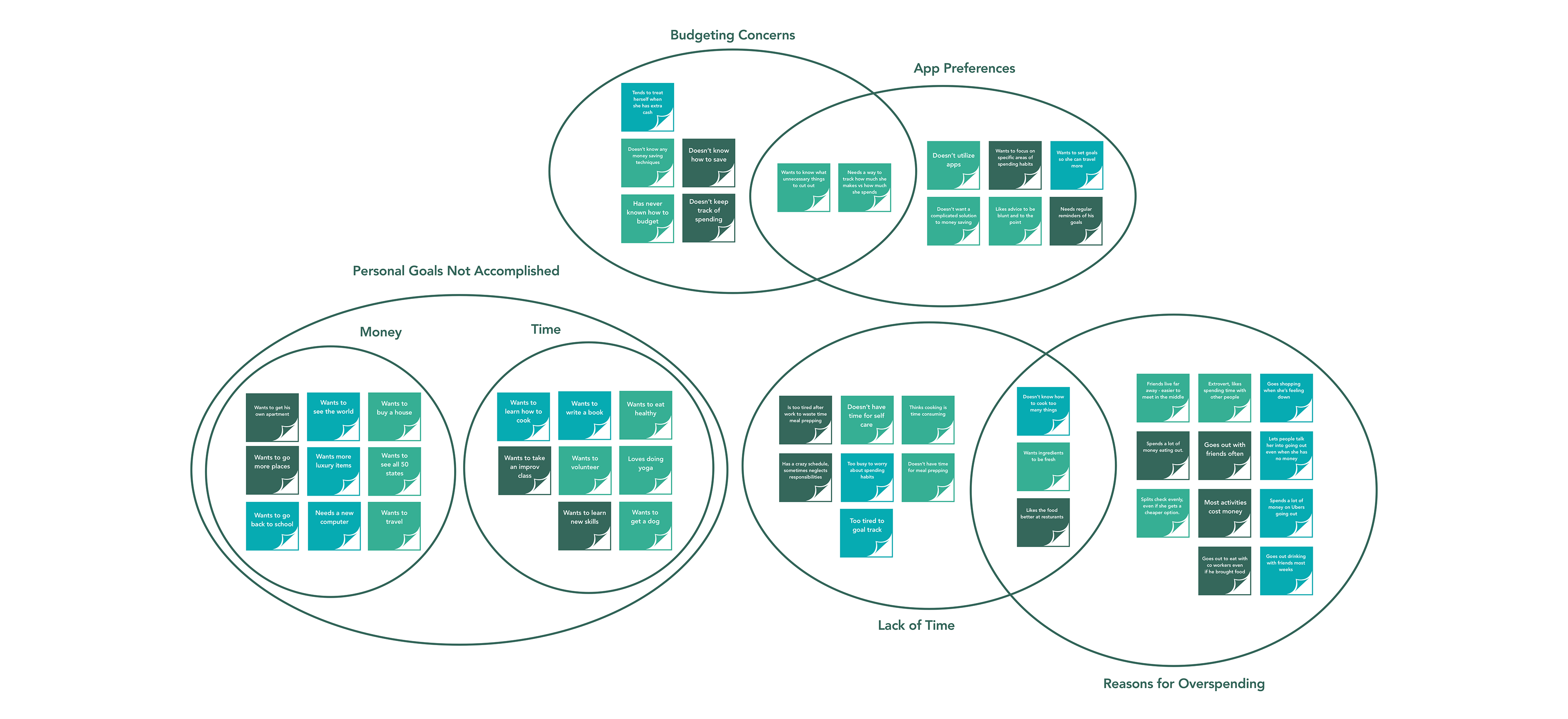
I began this day by synthesizing the research from my interviews into an affinity diagram. It came to my attention that none of my users felt good about their overspending habits, and often regretted them the next day. They also didn't seem to realize how badly they were doing until they came up short on their goals. Due to busy lifestyles, they didn't have a way to keep up with the overspending they were doing on a daily and weekly basis, and they couldn't figure out where to start.
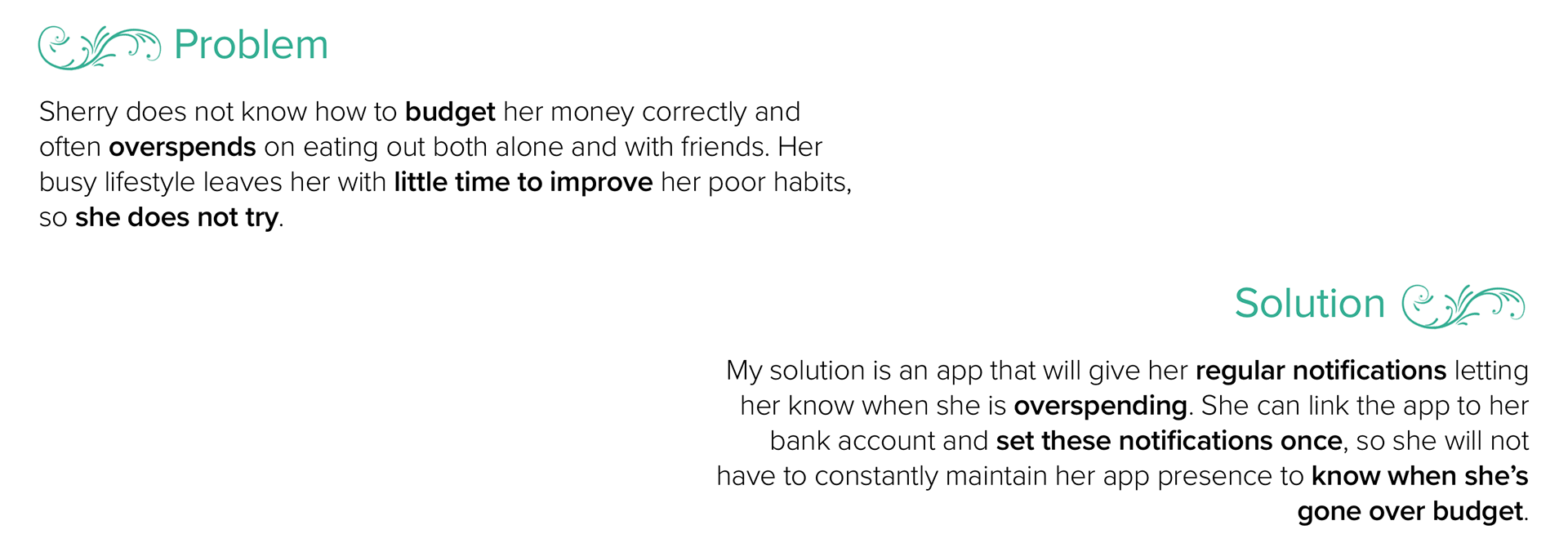
I used this to develop Sherry's persona, and define the problem and solution statements.
Day 4
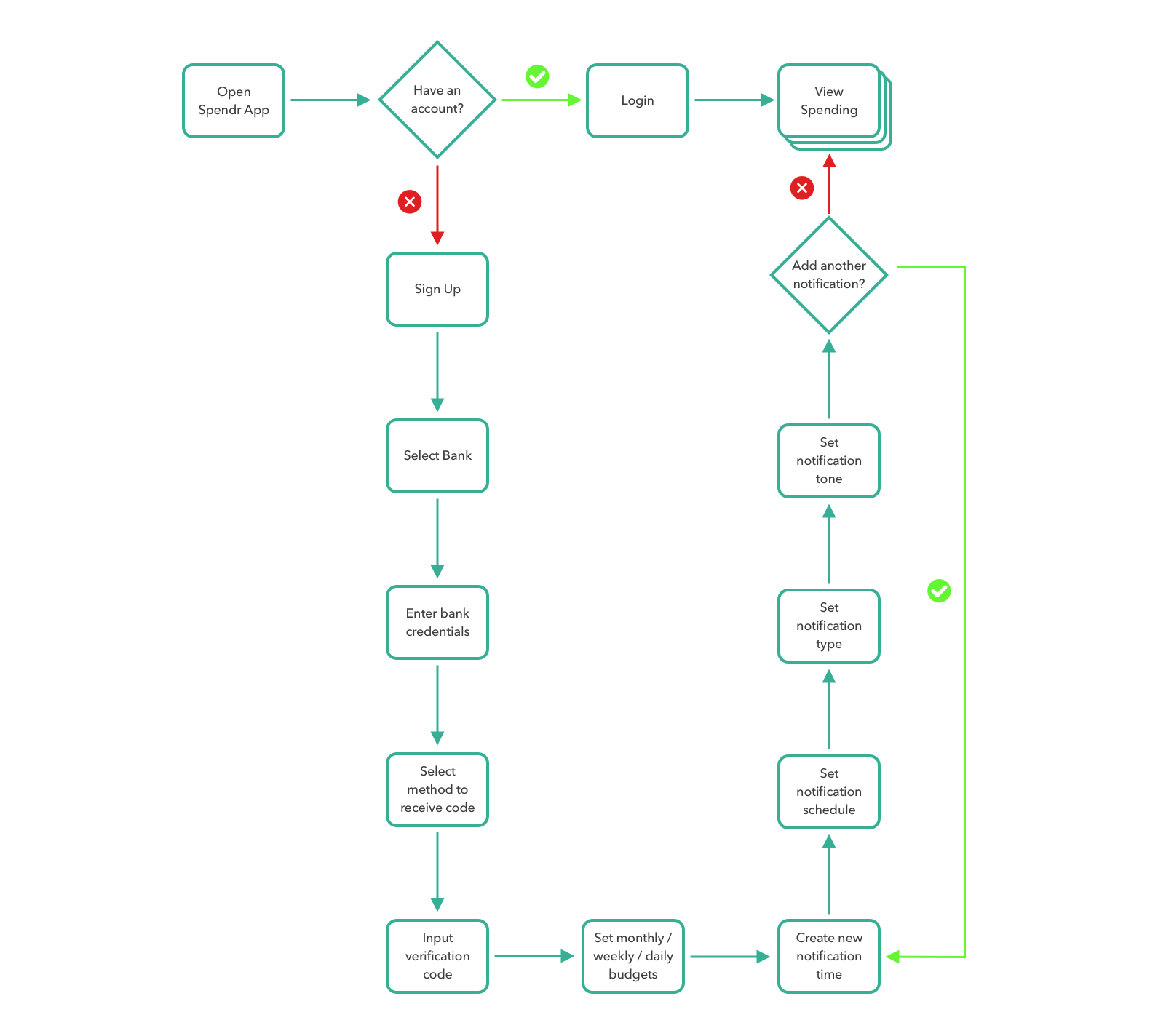
I made a user flow for the Spendr app to guide me along in my design decisions. The user flow follows Sherry through the process of signing up for the app, linking a bank account, inputting a budget, setting notifications, and viewing her spending by day, week, and month. After the first time using the app, the user flow would start where it currently ends, but the user would still be able to go back and change their account information, budget, and add or remove notifications.
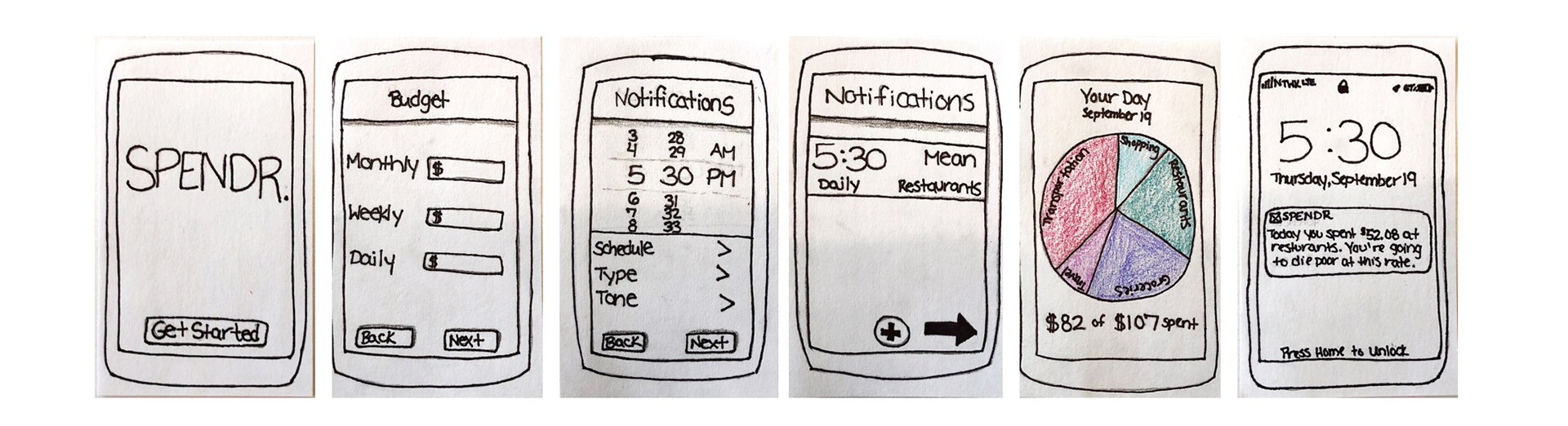
I then proceeded to some rough sketches for usability testing purposes. Subjects found the button placement and size of relative text to be confusing, which led me to make some changes in my second and third iterations. I A/B tested a few variations of the types of notifications, because Sherry wanted them to be direct, aggressive, and no nonsense. The result was a very simple, easy to use budget app with a multi-faceted and customizable notification system for Sherry’s needs. All that was left to do was to make the high fidelity prototype.
Day 5
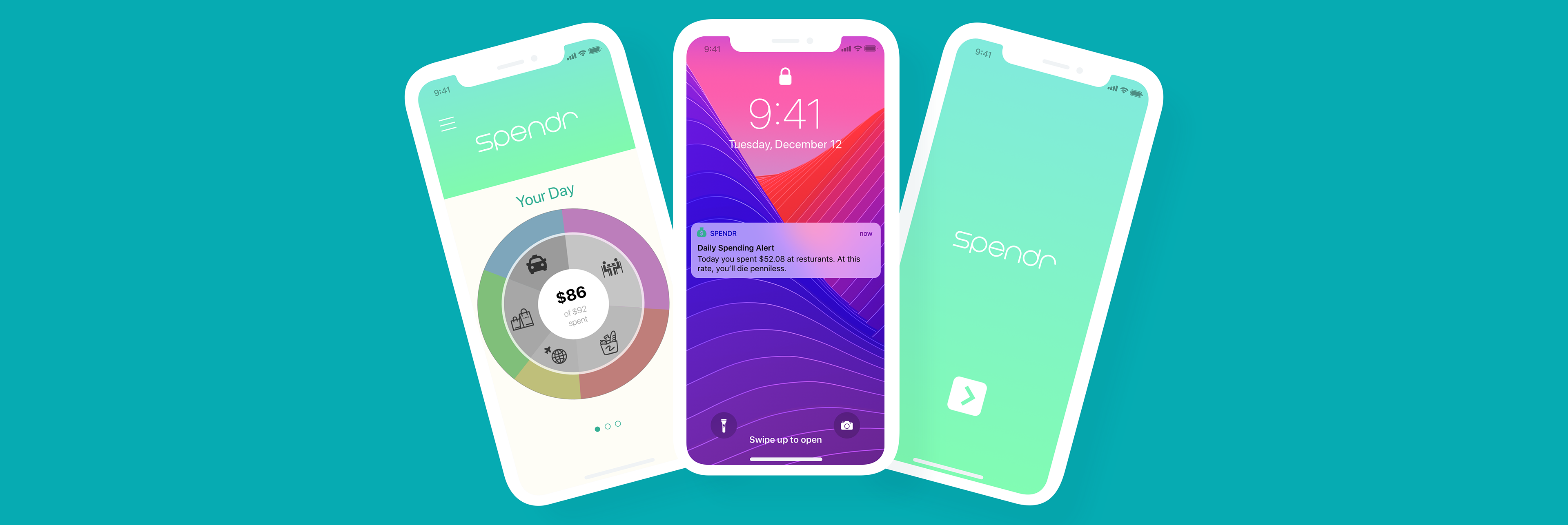
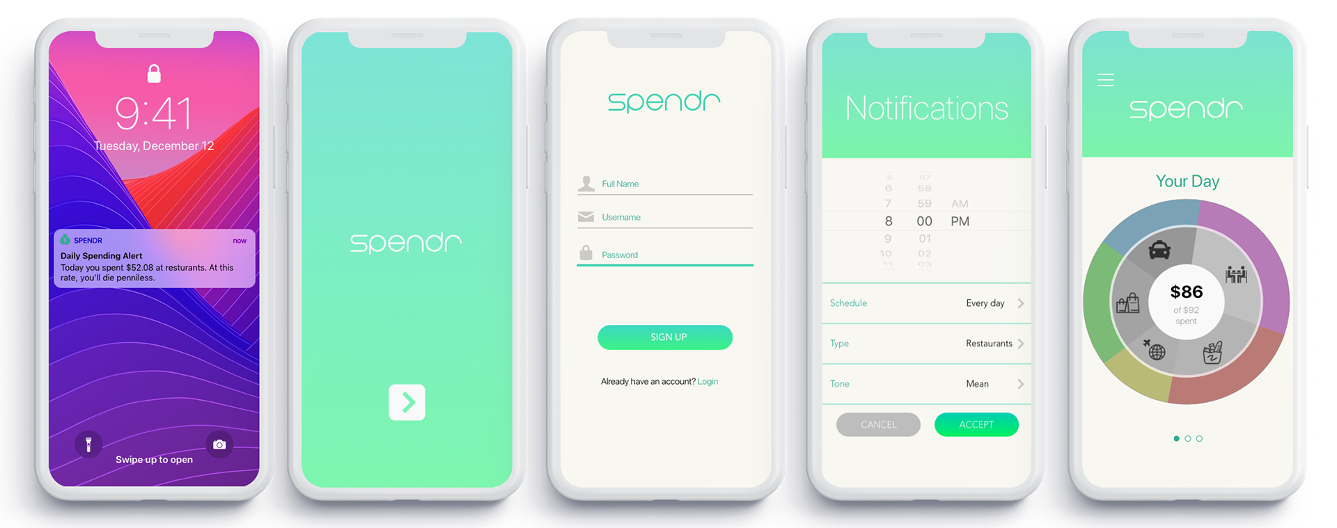
I created the high fidelity prototype for the Spendr App, taking into account the usability test results. It follows the user flow through signing up for the app, linking a bank account, and setting a budget and notifications. It ends on the home screen, where the user views their spending.
Next Steps
This was a short sprint, so I definitely didn't have time to do everything I wanted to. If given more time, I would have liked to interview more possible users of different age groups. It also would have been nice to do more usability tests and A/B test certain features, especially the spending pie chart. From this experience, I learned how to work on a strict deadline at a rapid pace, as well as prioritizing my time to do as much research as possible without sacrificing UI. Additionally, from discovering Sherry's dislike of apps, I learned not to let personal bias affect my designs and instead consider the user's needs.