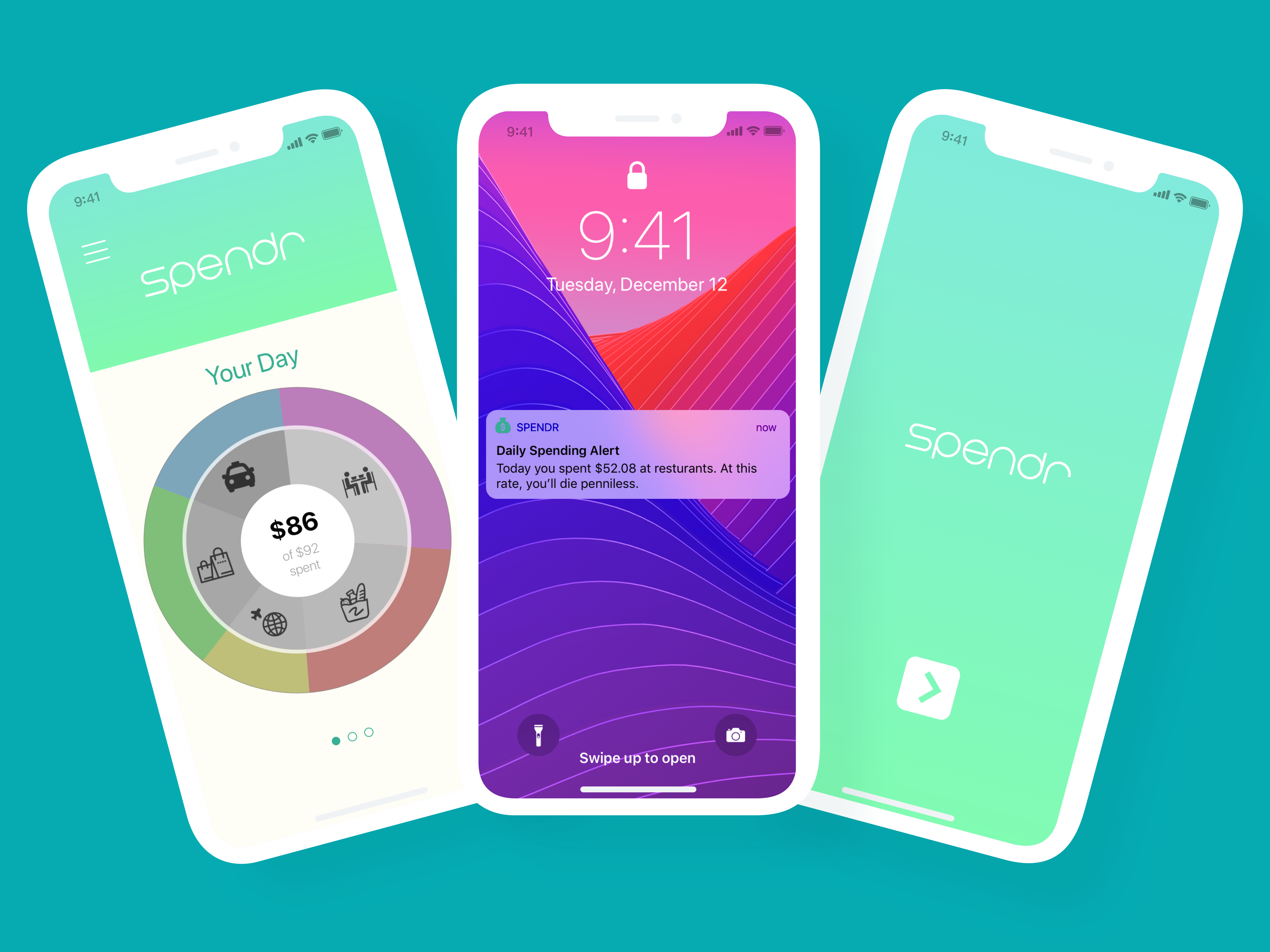

Intention:
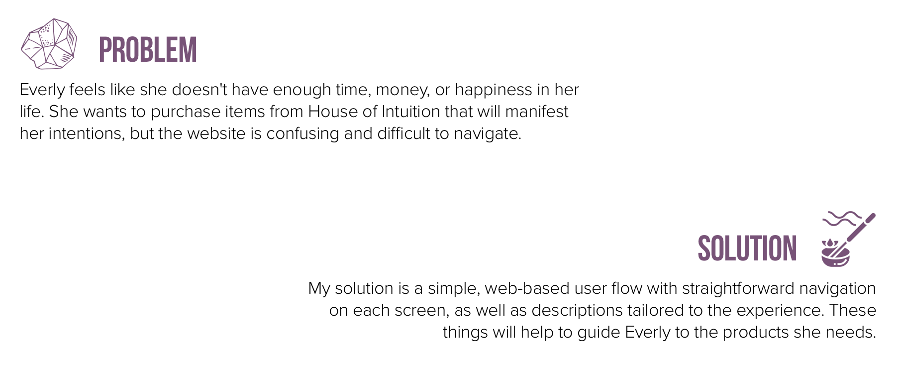
House of Intuition has seven locations in California with one coming soon in Miami, with a large following. Its creators, Marlene Vargas and Alex Naranjo, have a very specific brand, with clean, organized black and white walls and handcrafted products. They differentiate themselves within a niche market, and their ideas have paid off. Unfortunately, their brand is not translating to their website. The navigation is messy and overwhelming, with too many things being thrown at users at once. They need a cleaner design that will match their presence in the real world.
Perception:
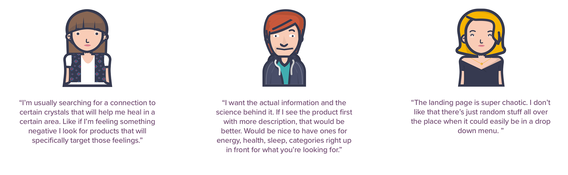
I started by conducting user interviews and task analysis on the current site with a novice user, a slightly more informed user, and an expert user. They had varying opinions based on their knowledge level, but all three agreed on the following:
• The landing page is too busy with far too much scrolling.
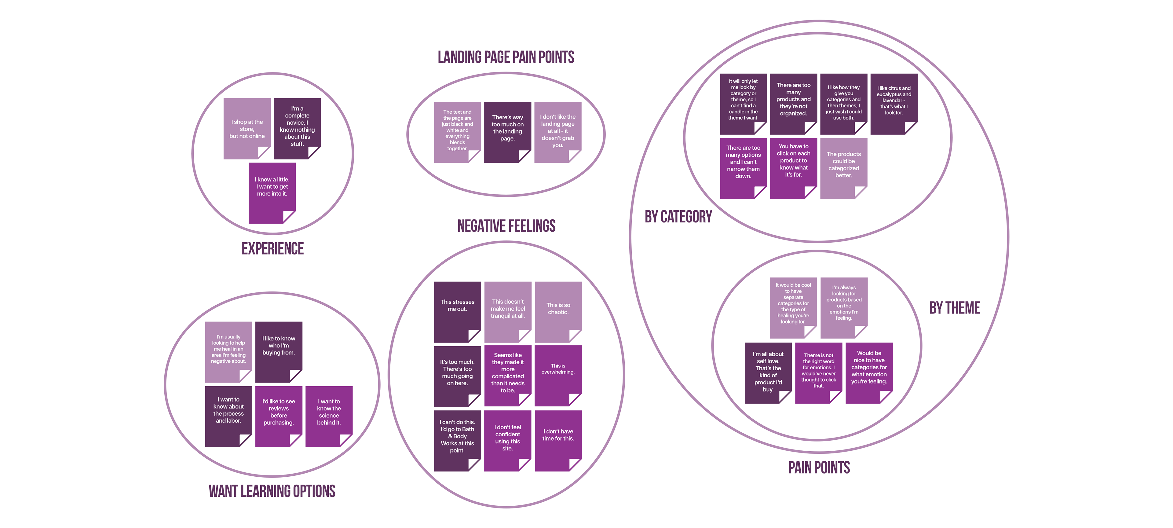
• They wanted to shop for things based on the pain points and emotions they were feeling, as these items are spiritual.
• They found it difficult to impossible to find what they were looking for due to difficult to use primary and secondary navigation.
• All three participants wanted to give up on looking within five minutes of starting.
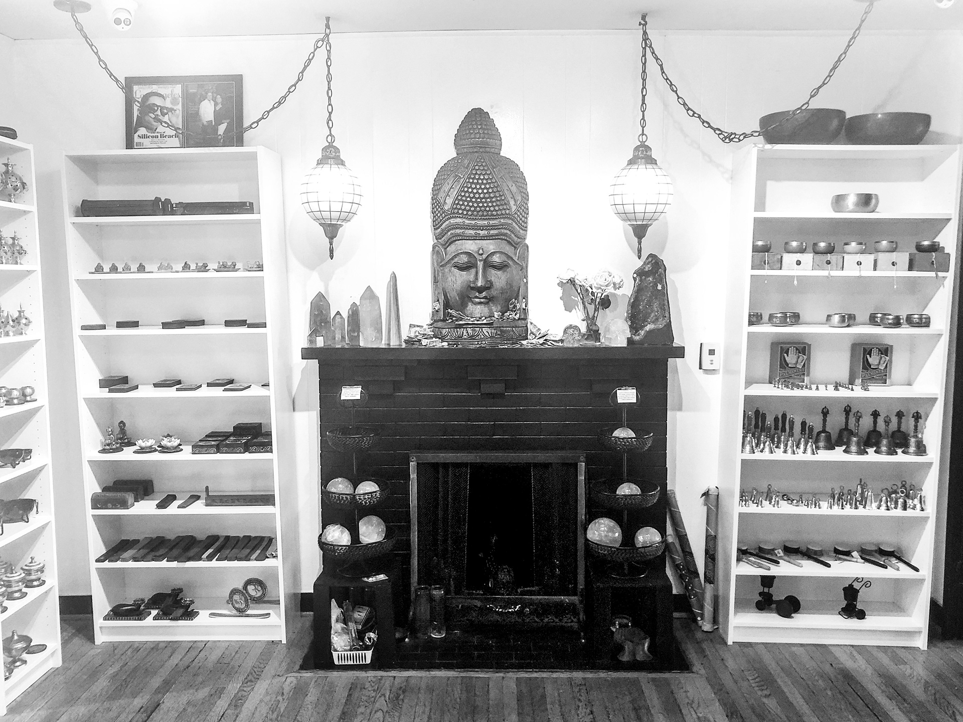
For contextual inquiry, I took a trip to House of Intuition in Echo Park, where I watched shoppers interact with the products, and chatted with a knowledgeable and enlightened “Gate Keeper” (House of Intuition’s name for their sales associates). She spoke about manifesting intentions and finding the right products for the problems the seeker faced. She created a warm, interesting environment that suggested anyone could make their lives better with the products available. I came out of the experience feeling refreshed and motivated.
So why is the website the antithesis of that venture, and what can we do to make it better?
After compiling the research into an affinity diagram of the users’ pain points, as well as contextual inquiry, I was able to better understand the core issues.
• Users wanted to search based on what they were feeling. This was a possibility under "Shop by Theme," but none of the users seemed to know what that meant, so they didn't click it.
• The landing page is extremely cluttered and overwhelming, and made users want to give up before starting to shop.
• House of Intuition's brick and mortar shops give a sense of spirituality, and immerse you in the experience, making you feel knowledgeable about the products being purchased.
• It's impossible to shop by category within theme, and vice versa, which competitors were able to accomplish.
Manifestation:
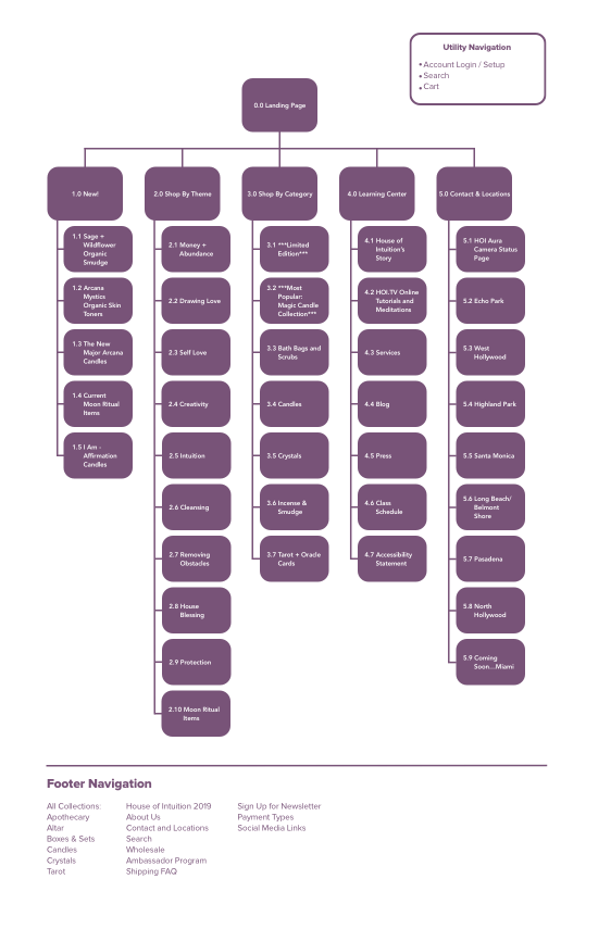
I created a sitemap of the existing navigation to flush out redundancies and text heavy product navigation, and then conducted both an open and a closed card sort. Both sorters had difficulty with some of the categories, and did not understand what certain words meant. It was very difficult for them to place some of the language, and it seemed like it could only be targeted at a very advanced user, leaving novice users confused and easily overwhelmed. I then created a sitemap for my prototype, alleviating these concerns.
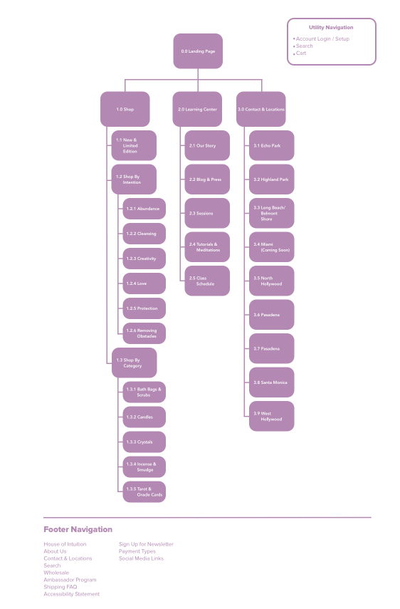
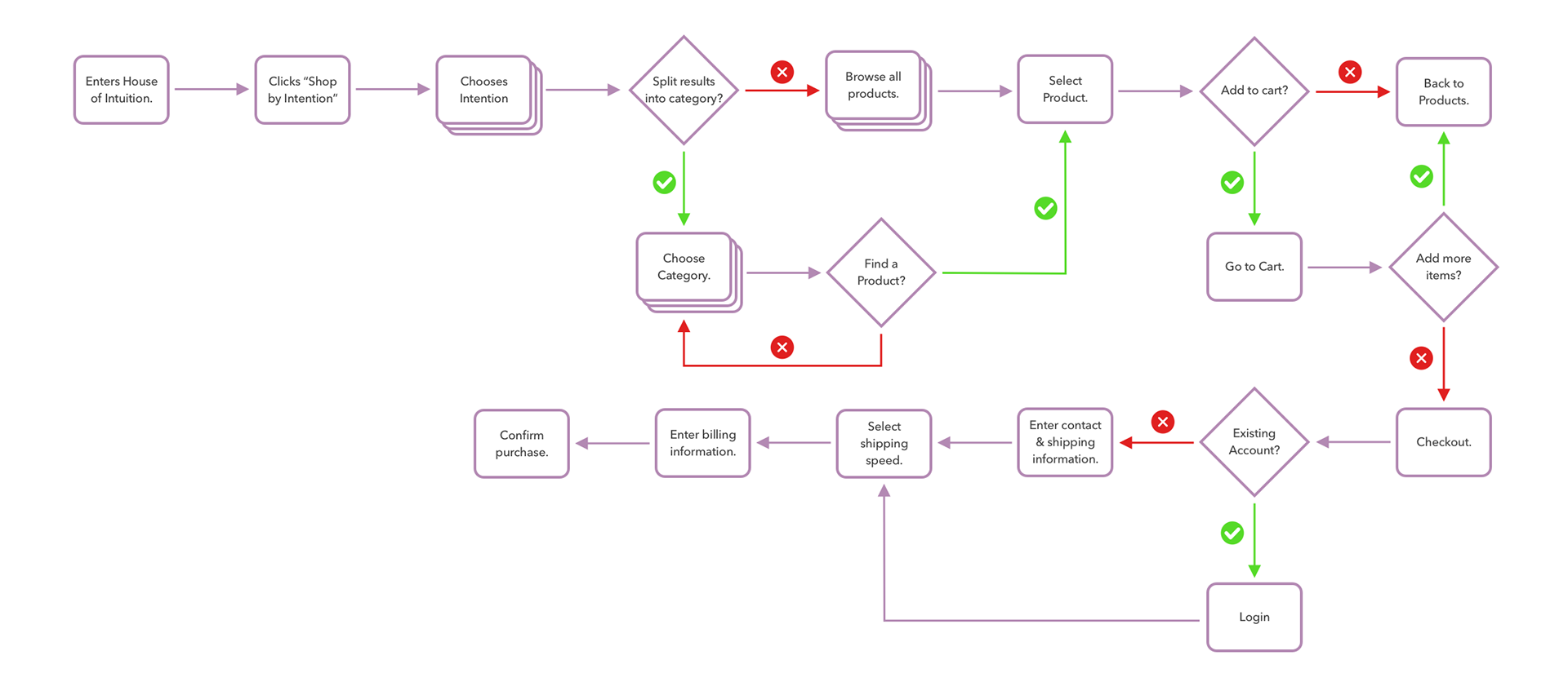
I wanted to make a simple user flow that would get the user from Point A to Checkout without becoming distressed. I added secondary navigation that would help the flow of the primary, without sending the user on a wild goose chase into the unknown. I added breadcrumbs to a site which sorely lacked them, so it would be easy for the user to know exactly what actions they had taken.
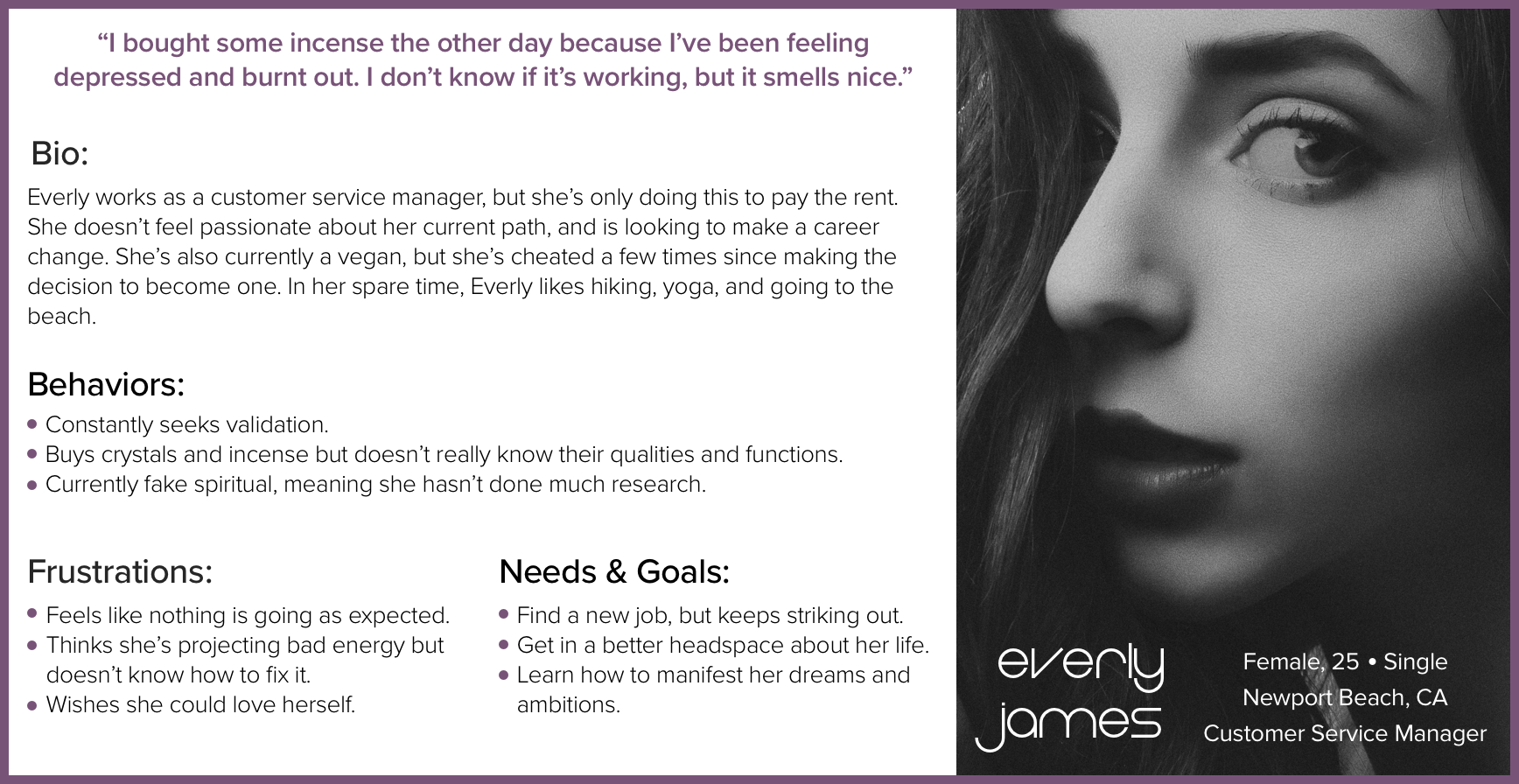
My user persona, Everly James, has an intermediate knowledge of the products being sold. The novice user would still be able to guide themselves through the site, but would lack the skill set to know all of the details about the products being offered, as this is a niche market that requires research to become engaged. The advanced user would typically prefer going into the store, as they enjoy feeling the products' energy and auras. Everly, the intermediate user, is more likely to utilize the website for purchasing, and is therefore the target customer.
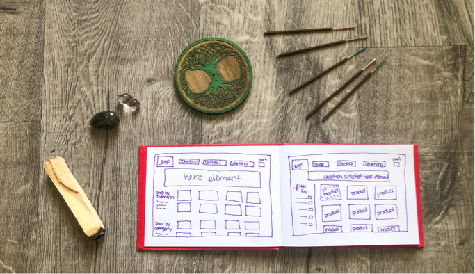
With all of this knowledge in mind, I drafted some sketches of the landing, product, product description, and checkout pages. I wanted to make sure I kept everything as simple as possible, with instructional images and strong details about the product being sold. I also wanted to include secondary navigation so users could easily filter their products further once they chose their intention, which was one of the main pain points of the original site.
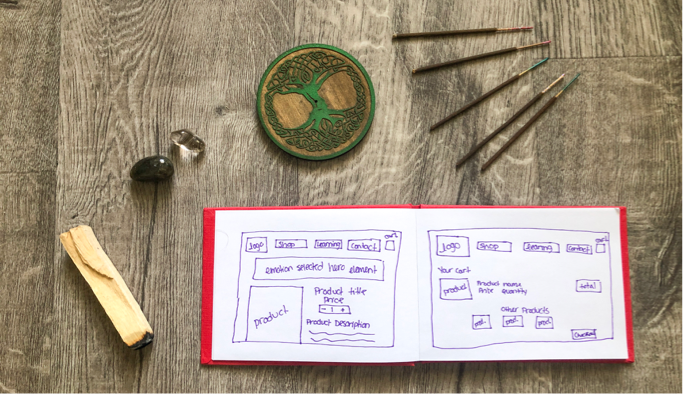
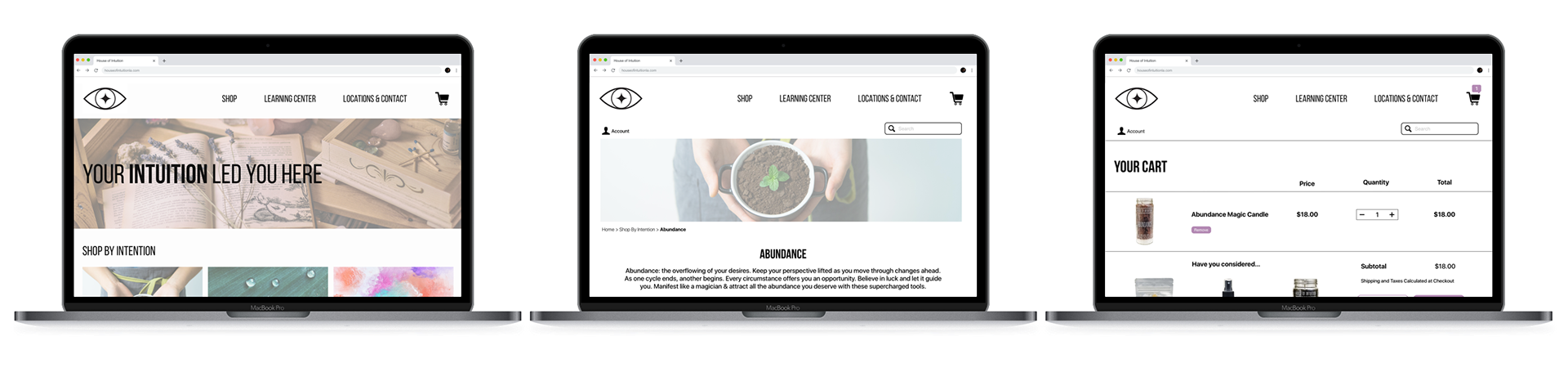
I created mid fidelity wireframes for usability testing, and then made them into a clickable prototype in InVision. I promoted my testers to find a candle that will help you manifest the intention of abundance, and proceed through the checkout process.
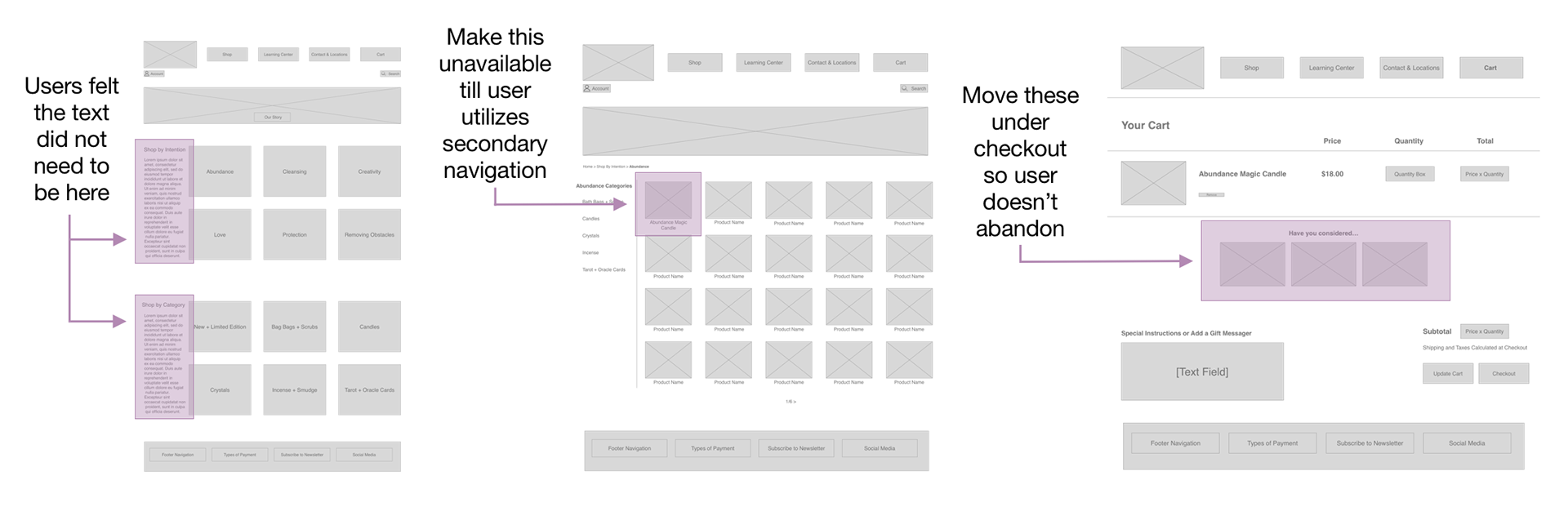
Users felt the text on the landing page was unnecessary, and would look cleaner without. They felt they should not need to scroll past additional products in order to check out on the checkout screen. They did not attempt to use the sidebar (secondary) navigation on the product page because I had listed the abundance candle first, so I wanted to make sure I showcased that in my final prototype.
Crystal Ball gazing into the future:
ACCOUNT: I did create an account on House of Intuition for research purposes, but I was given no indication that the action had been taken until I started receiving emails.
LEARNING CENTER: The learning center goes to a different website, with a ton of content. But like the shopping on House of Intuition, it is cluttered and difficult to digest. I would like to overhaul that area as well, due to the heavy influence on research to learn about this culture.
REVIEWS: There are not many products with reviews on House of Intuition, which makes it difficult for buyers to know the quality of the product they’re purchasing. It would be nice to have some incentive to encourage purchasers to leave reviews for future customers.