Hey Siri, let's go somewhere.
Got it. Pulling up Intrepid Travel.

First things first: the Intrepid Travel site
Intrepid Travel, a certified B Corporation, is a group travel one-stop-shop offering authentic experiences internationally. Their primary focus is to use travel to benefit communities, as well as having a mindfulness of environmental obligation. Their web presence is targeted towards gap year travelers aged 18-29, offering rugged lodging and an overall theme of "roughing it." This brand seems to be working, enough that older, active travelers also want to utilize their packages. However, it is difficult for users to find the right package to suit their needs.
Enter us: a team of four designers with a passion for globe-trotting and user experience. Our mission was to make Intrepid Travel more inclusive and easier to use, thereby making their site more profitable and enjoyable for wanderers and wayfarers of all ages.
Pack your bags, the excursion begins here
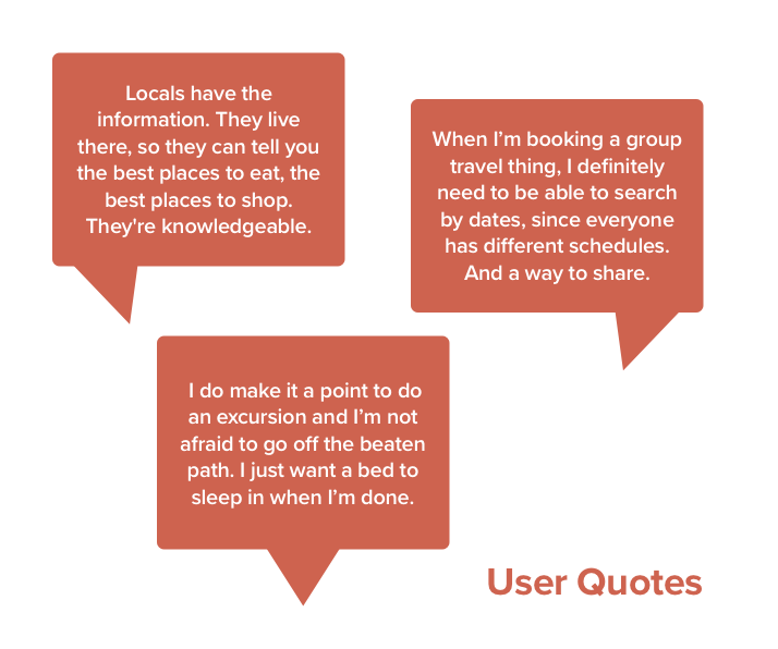
We eliminated gap year travelers from the interview pool, since they were already represented on the existing site. What was left - everyone else. While the rest of my team tackled other age groups, I interviewed a couple in their 60's. We pooled the results of our interviews and found a lot of commonalities. A love of straying from the beaten path and experiencing other cultures authentically has no age limit. However, they tend to require different amenities.
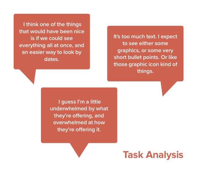
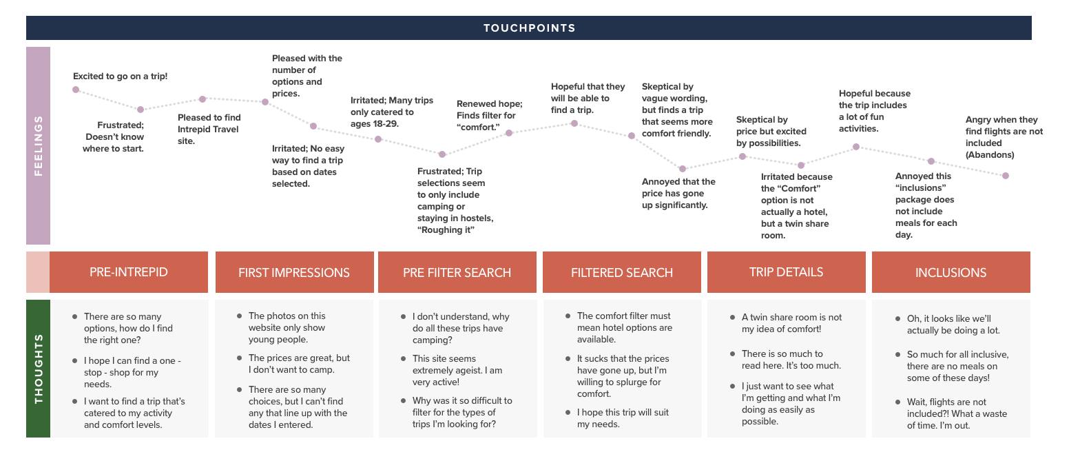
We also conducted task analysis of the existing Intrepid Travel interface. I instructed the users to find a trip to any location they desired, learn about it, and proceed to booking.
Some key insights:
• Users wanted to search by dates of availability.
• Users didn't want to read large blocks of text, and instead be able to view their options simply.
• They became frustrated when they discovered that flights and all meals were not included.
• They struggled to find the filters menu, and did not want to sleep in a tent or a "twin share room."
• Users didn't want to read large blocks of text, and instead be able to view their options simply.
• They became frustrated when they discovered that flights and all meals were not included.
• They struggled to find the filters menu, and did not want to sleep in a tent or a "twin share room."
Competitive Traveling

With a growing list of pain points among the users, I did a C&C analysis. Other sites promoting travel experiences used strong visual elements, quick overviews, and customizable searches. I also looked into indirect competitors like Patagonia and Everlane, websites that perpetrate authenticity, social responsibility, and sustainability. There were features from each of these sites that we could use to better emphasize Intrepid Travel's core mission, as well as their navigation.
Time to meet your fellow passenger
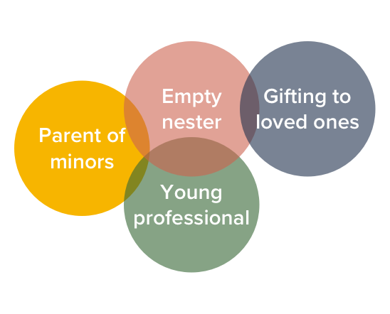
Before crafting our persona, we needed to consider the primary age range to target. I narrowed the users into four different categories: The young professional, the parent of minors, the empty nester, and the gift giver.
I came to the realization that the empty nester shared attributes with each of the other three proto personas. They tend to have disposable income and definitive dates of availability like the young professional, a need for comfortable lodging and detailed itineraries like the parent of minors, and specific dietary and activity level concerns like the gift giver.
Using this, we came to our problem and solution statement and got acquainted with our persona, Jaime Lee.
Looking through the research, it came to our attention that there was no gender bias in the problems within the site. Each of our users had the same concerns, regardless of gender. For that reason, we chose to make Jaime non binary, so the could better represent the scope of our target audience.
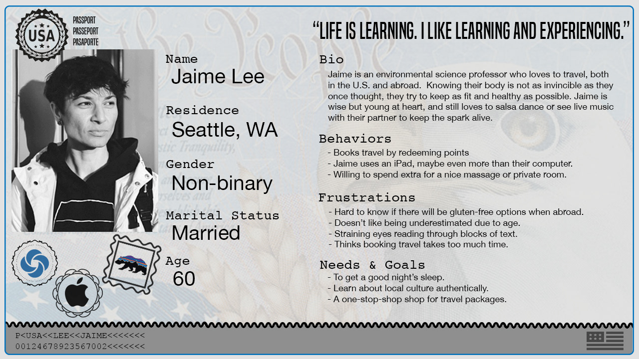
I took Jaime on a journey of the existing site. Jaime felt the vague wording didn't provoke a sense of confidence -- "roughing it" during the day did not necessarily translate to sleeping on the ground, but they struggled to find a package with a hotel. They were frustrated by the lack of calendar functionality, as even when Jaime was able to add their dates, the search results did not reflect them.
The ultimate breaking point was when Jaime found that the inclusions of the trip did not include meals for each day, with no explanation. Towards the bottom of the trip's page, Jaime found that flights were also not included, and abandoned the search.
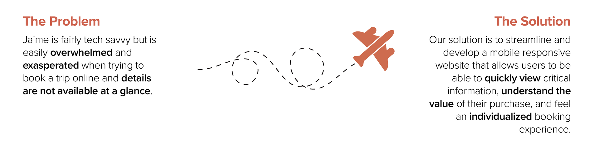
I decided it was imperative to include clearer wording, maximum transparency, and a better way to search trips by dates of travel.
Jet-setting into design
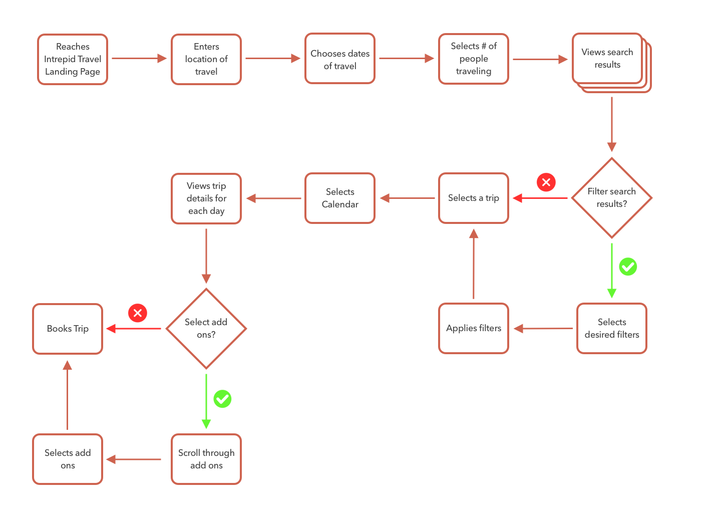
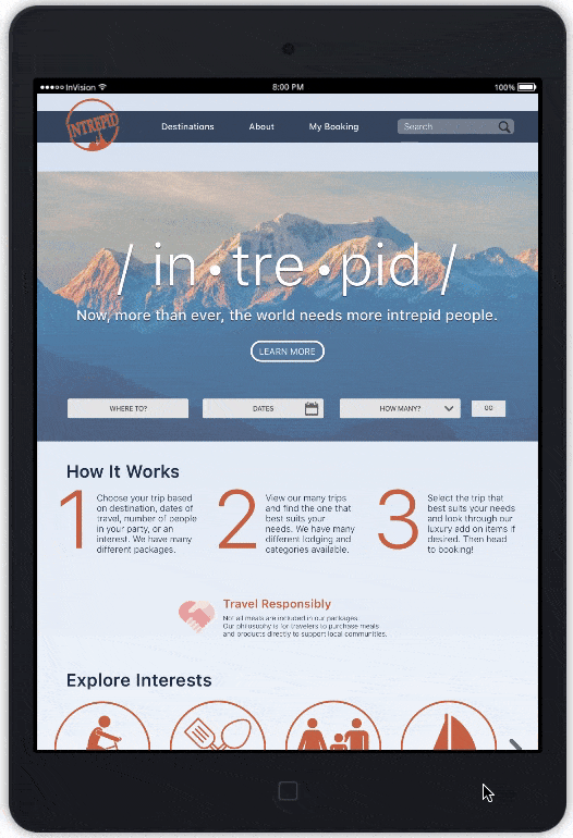
Considering Jaime's journey map, I made a user flow to consider before designing. I added a calendar to the search bar on the landing page. I also included the option to search by number of people in the party (with group travel packages, there are only a certain number of individuals who can sign up for a trip).
Since the search results filters of the existing site were difficult to find, I wanted to make sure it would be easy for Jaime to filter their options. I also added an option for luxury add ons, since users were displeased with their options for comfort.
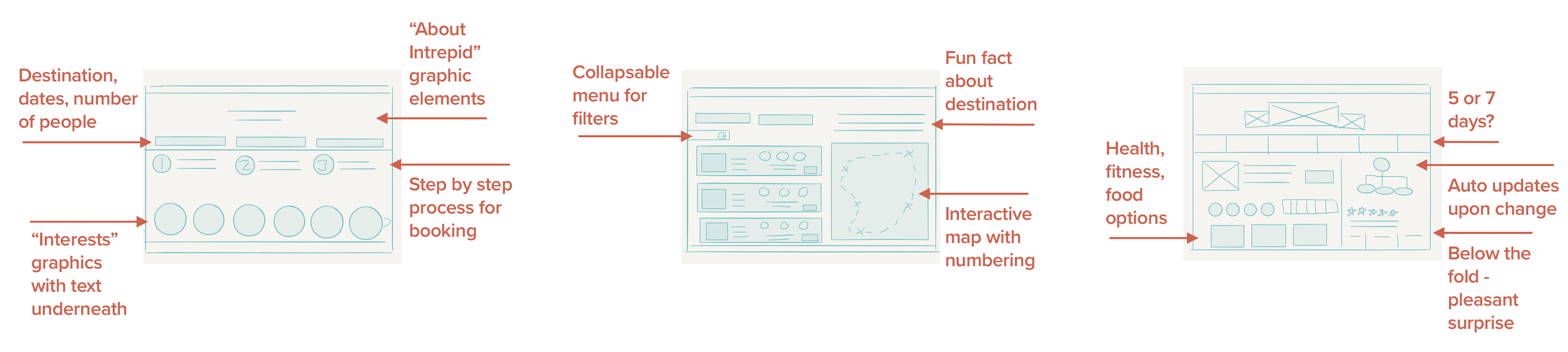
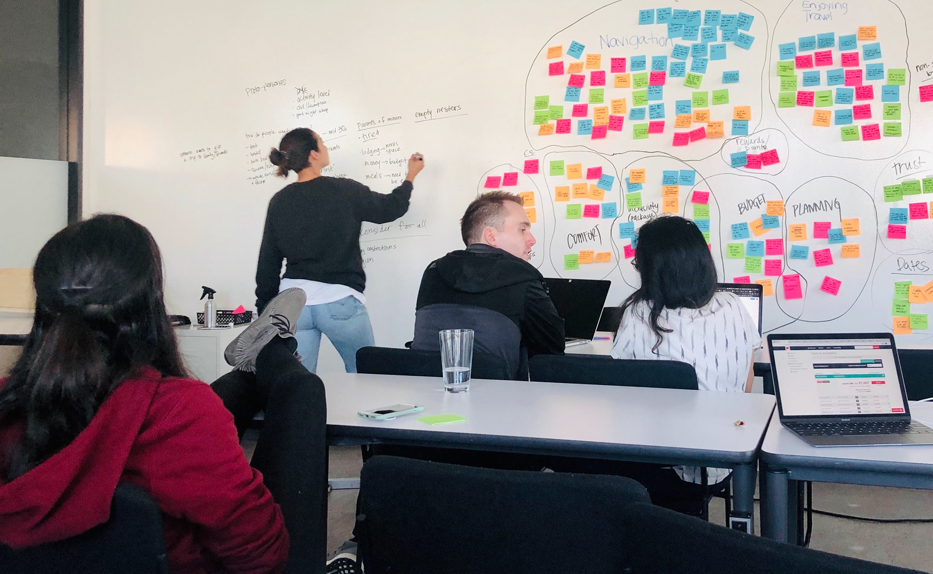
We then did a design studio to synthesize our research into multiple iterations of our key screens. We flushed out the details we wanted to include on the landing page, search results page, and trip page. After design studio, I drew our preliminary sketches (above), and crafted our initial wireframes (below) to usability test. The usability tests indicated quite a few issues that we would need to adjust before moving to the high fidelity prototype.
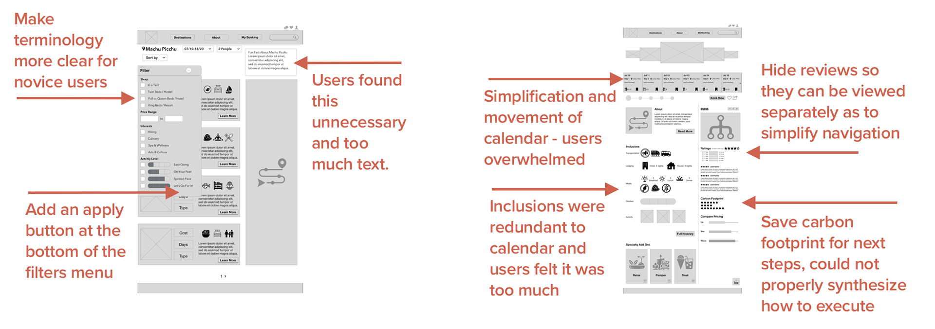
The most important lesson I learned from this process was the need for feature prioritization. Through design studio, sketching, and wireframes, we kept adding features that we thought users might enjoy, as well as keeping maximum transparency and social responsibility as a theme.
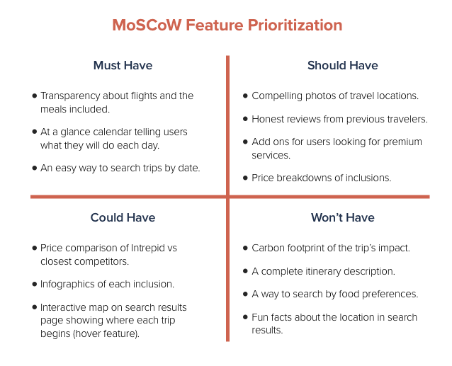
The unfortunate result was that users found our first few iterations to be overwhelming, which was a core problem of the existing site. It was a challenge to figure out which ideas needed to be removed to create a more seamless booking experience, so I used the MoSCoW Method to categorize our features' importance.
We referred back to the MoSCoW as we created our next iterations, removing the features we felt would have the least impact on our users, and usability testing them along the way. This led us to our final prototype.
Let's book a trip to Italy!
We begin on the Landing page of the Intrepid site, where Jaime enters their location, dates, and the number of people in their party. Once entered, they use the filters menu to find the perfect trip for their needs.
Once Jaime finds the right trip, they scroll through the calendar to view all of the amazing places they'll be seeing while in Italy.
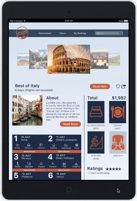
Our tour ends with Jaime viewing Add-on packages for massages. The dates when they will be hiking are not available, and Jaime selects a different day. After adding a 90 minute massage, the Add-on shows in their financial breakdown of the trip, and the price updates. They then proceed to book.

Sights to see on the next trip
If given more time, I would have loved to flush out the carbon footprint feature. As a certified B Corporation, Intrepid Travel is committed to understanding its social and environmental impact. We wanted to include to reflect that commitment, but ran out of time. Also, it would have been great to do further research into travel agents and the way they provide personalized customer service, so we could later integrate that, as well as an API for flight booking.
This exploration was an important learning experience for me. Due to travel being one of my primary passions, I found myself very excited to implement the features we were considering. Unfortunately, that led to cluttered navigation and an overwhelming experience, which negated the overall pain points. I gained a vital lesson in feature prioritization during this initiative: I am not the user.
This flight never would've gotten off the ground without my team of voyagers: Joey Gannon, Luna Kawashima, and Paige Libadisos. We trekked this expedition together.